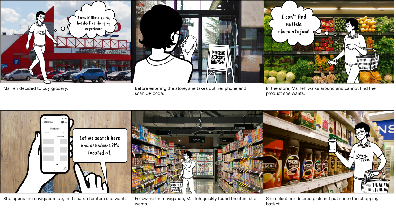
Storyboard
Task 1: Select items and Task 2: Scan barcode
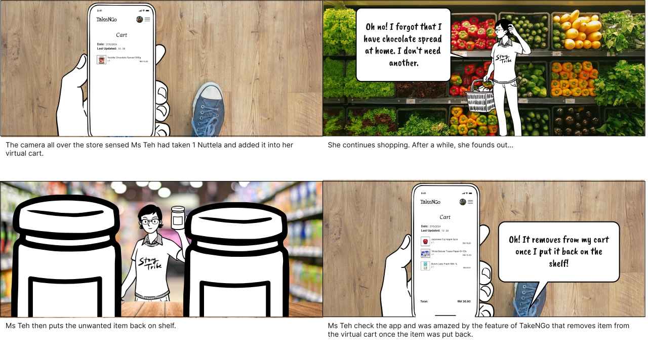
In our proposal, the action of selecting items and scanning barcodes are
done simultaneously. When a user selects an item and puts it inside his
shopping basket or bag, the item is automatically added to the virtual
cart in our application and the user does not have to scan the
barcode.
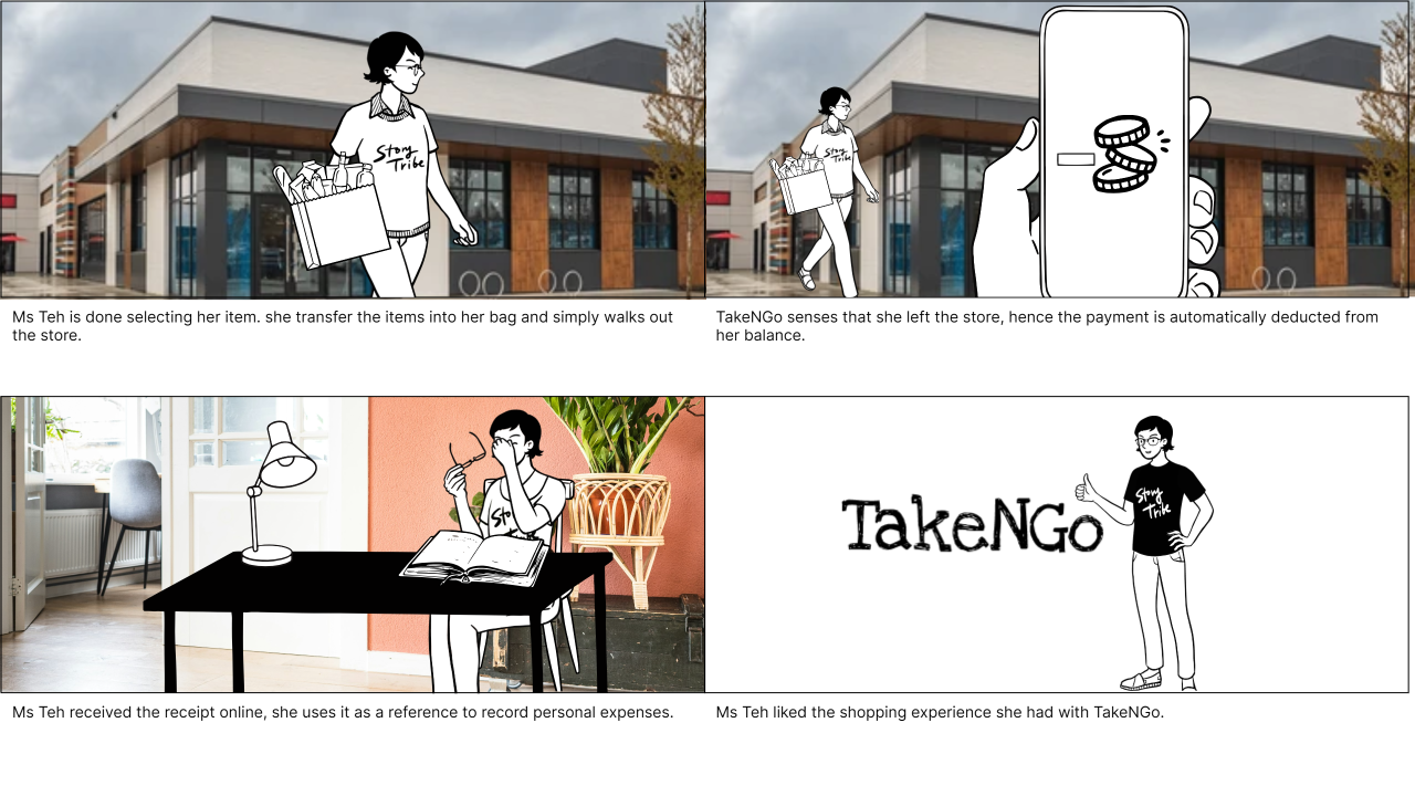
Task 3: Make Payment
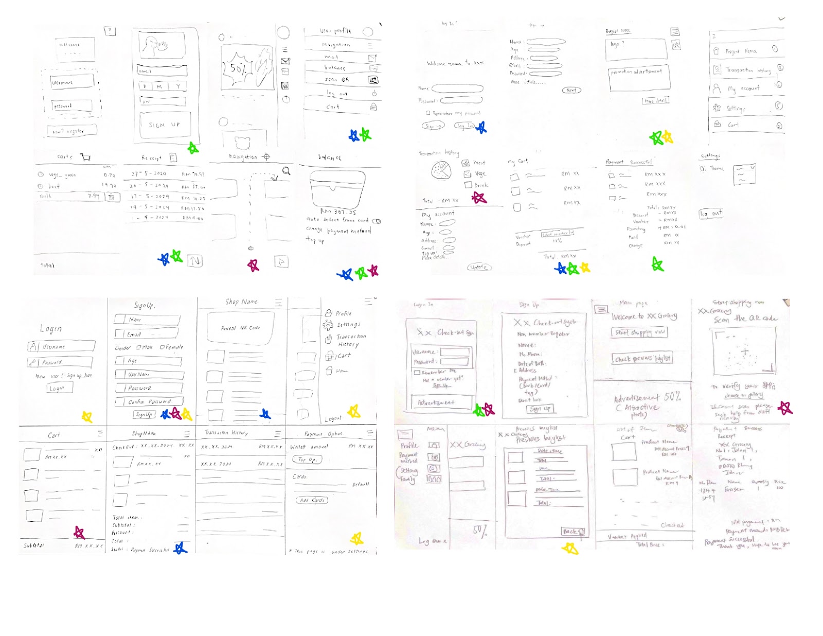
Alternative Designs (Crazy 8)
We are applying the Crazy 8 method to our interface design project in
order to generate ideas fast. Each of us has eight minutes to create eight
alternative interface sketches in this quick and enjoyable activity. It
encourages creative thinking and the generation of as many different ideas
as possible without being overly concerned with details. At the end of the
activity, we discuss and choose the best idea for each concept by voting.
This enables us to see several options and identify the most promising
concepts for further development.
Below is the overview of our Crazy 8 exercise of interface design.
Alternative Design 1 - Tan Yi Ya

Alternative Design 2 - Teh Ru Qian

Alternative Design 3 - Lam Yoke Yu

Alternative Design 4 - Goe Jie Ying

Voting Result
Tan Yi Ya
Teh Ru Qian
Lam Yoke Yu
Goe Jie Ying
Wireframes
The following is the wireframes for the entire application:
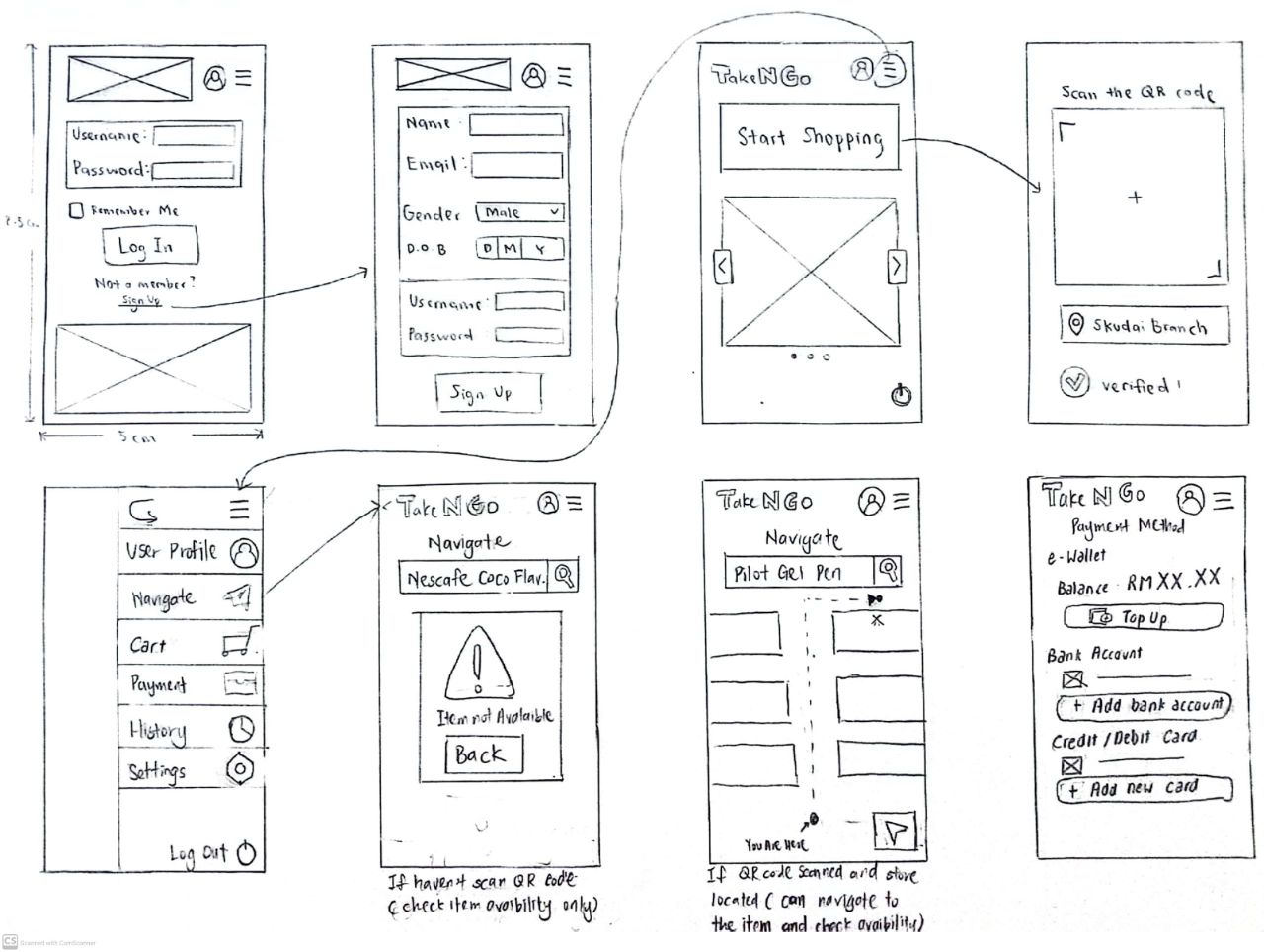
In the proposed system, some tasks identified in the task analysis are
simplified or superseded with another action.
Wireframe for Task 2 - Scan Barcode
Scan the barcode provided before entering the store. Previously, the task
identified was to scan the barcode of the selected items before checkout.
However, in the proposed system, the user would need to scan the barcode or
QR code as in checking-in to the shop.

Wireframe for Task 1 - Select item and Add to Cart
Select the desired item from the shelf, and it will be automatically added
to the cart.
Wireframe for Task 3 - Make Payment
When the users are done shopping and walk out of the store, the payment will
be automatically processed and a receipt will be generated.
Reason or Justification of the Design
1. Similarity
The principle of similarity is applied in the functional buttons in the
menu section as shown in the figure below. Each functional button maintains
the same size and format, ensuring uniformity. Additionally, each button is
accompanied by an icon that reflects its specific same level function,
enhancing user understanding and recognition.
The principle of consistency is applied throughout the app by keeping the
'Take N Go' logo at the top left corner of every page of the functions.
Additionally, the menu and user profile icons are always in the same place
on each page. This makes it easy for users to navigate since they always
know where to find these key features. The consistent layout helps create a
smooth and user-friendly experience.
3.Figure & Ground
In the navigation page, we apply the principle of figure and ground by
making the 'Navigate' text and search bar (the figure) stand out against a
white background (the ground). This helps users focus on essential elements
for navigation, enhancing readability and usability. Therefore, users can
easily locate the search bar and swiftly navigate to the item they want to
buy.
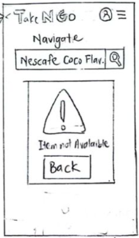
4. Dialogue
We also integrated dialogue as a design
principle to inform users when an item they
search for is unavailable. This prompt simply
notifies users about the unavailability of the
item and allows them to return to the
navigation page to continue their
search.
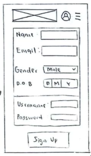
5. Enclosure
The principle of enclosure has been effectively applied in
our application, particularly in the user sign-up pages. In
the figure shown below, the enclosure creates a clear
separation between the section for user information and
other icons on the page. This distinct visual boundary makes
it easy for users to identify where they should input their
personal information to sign up for an account.
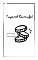
6. Continuity
The principle of continuity is evident during checkout,
where our users seamlessly transition as they step out
from the store. The app deducts the payment directly
from their wallet, enhancing the user experience by
maintaining seamless shopping within the store using the
app. As shown in the figure, when the user completes
shopping and exits the store, the system will
automatically deduct the payment and display a
successful payment page to the customer. This
facilitates the customer's continuity
.
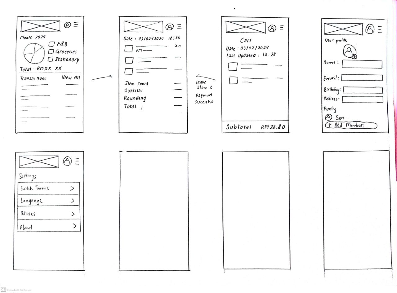
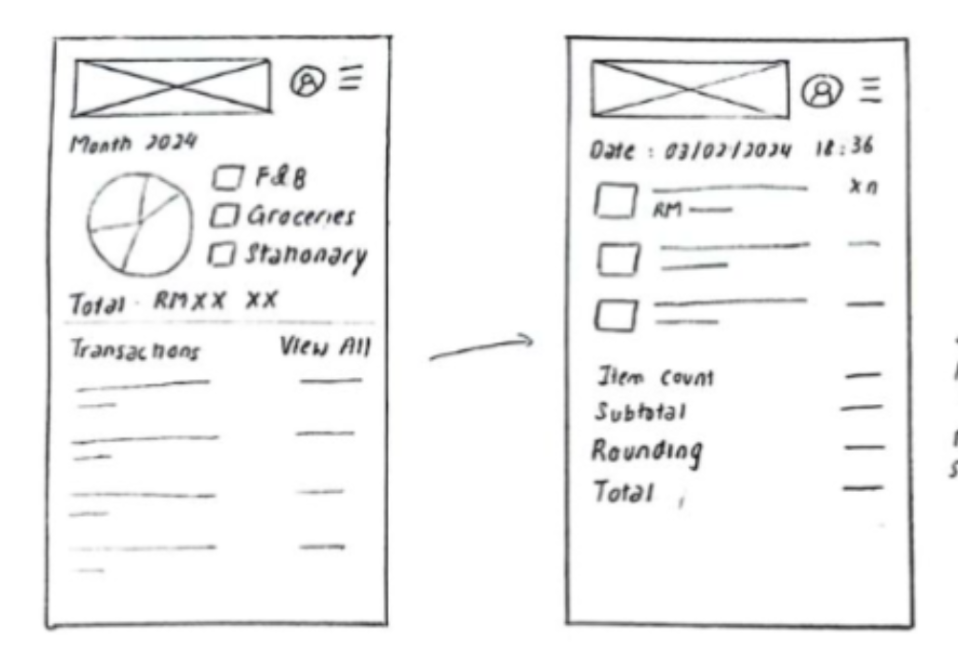
In the total expenses checking page, users can seamlessly
access a detailed buylist by clicking on the total price
of the receipt. This feature promotes continuity and
ensures users can easily review all items they have
purchased, enhancing their shopping experience with
comprehensive tracking capabilities.
7. Error handling
In our application, error handling is also incorporated
into the navigation page. When a user searches for an item
that is not found or enters an incorrect item name, the
system prompts a message informing them of the item's
unavailability. This message allows users to refine their
search and try again, ensuring they can continue their
shopping experience without interruption. This mechanism
provides clear feedback and maintains the continuity of
the user's navigation and search process.
Description of Incorporation of Design Requirement into App Design
1. Add a handheld scanner to help users scan the products
Instead of adding a handheld scanner, we discovered a more
convenient method in our prototype to address the issue of
scanning hard-to-reach items. We implemented a feature that
automatically adds items to the digital cart as soon as the
customer places them in the trolley. This design significantly
aids our target users by eliminating the need to scan barcodes at
the self-checkout counter. Customers simply place items in their
trolley, and our system records their purchases instantly in the
application.
2. Implement face recognition functionality
The Take N Go app integrates facial recognition (FR) at the sign-in stage, allowing all users entering the store to be
recognised. As users enter, cameras would capture their faces,
matching them with the identity recorded when the user scanned the
QR code at entry. To enhance security against theft, an alarm
would sound if one was not checked in at the entry. Thus, a user
must be signed in to the application and scan the QR code before
they enter the store.
3. Offer the user to choose self-service or staff assistance
When initially designing our system, we considered offering users
a choice between two methods to change their payment method based
on user feedback. However, we have now developed a more efficient
solution. Users can directly select their payment method within
the application, enabling them to add multiple methods or link to
a bank card. In the event of payment failure, the system
automatically switches to an alternative payment method until
successful payment is achieved.
4. Provide a clear instruction for user to enter the
card
To simplify the payment process, users can now link their bank
card within the application. This eliminates the need to carry a
physical bank card, as the payment amount will be directly
deducted from the linked bank account or card after the users step
out of the store. By following these steps within the app, users
can easily manage their payment preferences and complete
transactions seamlessly.
Interaction Metaphor
1. Magnifying glass as Search button
In interface design, the magnifying glass symbol used as a
search button is a powerful metaphor. This icon represents
the process of looking for an item, just like the way to use
a magnifying glass to look closely and find details in the
real world. The magnifying glass icon in a digital interface
by default tells users that clicking on it will help them
search and find information, just as a magnifying glass lets
people see things more clearly and find what they're looking
for.
2. Image of a person as User Profile button

A person's appearance, usually shown as a head and shoulders
silhouette, is a metaphor in digital interfaces for obtaining
access to the user profile. This metaphor draws from the
real-world concept of identity and personal representation. Just
as a portrait represents an individual in the physical world,
this icon signifies the user's personal space within the digital
environment. When users see this icon, they intuitively know
that clicking it will take them to their profile, where they can
access and update their personal information and account
settings.
3. Three horizontal lines as Menu button
Digital interface menu buttons are represented by the three
horizontal lines, commonly referred to as the "hamburger
menu." This metaphor is based on the visual similarities of a
traditional paper list or menu, with items stacked one over
the other. The three horizontal lines icon, similar to a
printed menu, indicates that clicking on it will disclose a
list of options in this system.
4. The left and right button to change the pages of
promotions and offers
The promotion and offers section in the home page of the app
has a left and right arrow and the sides. This is akin to
flipping through pages of a book or magazine. Users would tap
the left button to go backward through the pages and right
button to move forward, just like turning pages in physical
publication. This metaphor is intuitive and familiar, making
it easier for users to understand how to navigate through
promotions and offers.
5. Tick mark to show that the users is checked into a
store
After the user scans the QR code at the store and successfully
records, the tick mark with the word “verified” will be
displayed, indicating their presence. In everyday use cases,
the tick mark always means correct and done. Thus, the tick
mark here is a visual cue that reassures users that they are
checked in.
6. The plus sign as Add Signal
There is the plus sign in all the buttons in the payment page.
This interface metaphor utilises the universal understanding
of mathematical symbols. In this metaphor, the plus sign (+)
serves as a visual cue to indicate the action of adding
something, in our case, to top-up the wallet, to add a bank
account and to add a new card.


Comments
Post a Comment